Harmony Public Schools is a system of 60+ Texas public charter schools that provides rigorous, high-quality education focused on Science, Technology, Engineering, and Math. Harmony provides students from traditionally underserved communities the opportunity to excel through project-based learning.
________________________________________________________________________________
Client/Company: Harmony Public Schools
Project: Develop a new brand for the Success program
Category: Environmental design, branding, identity
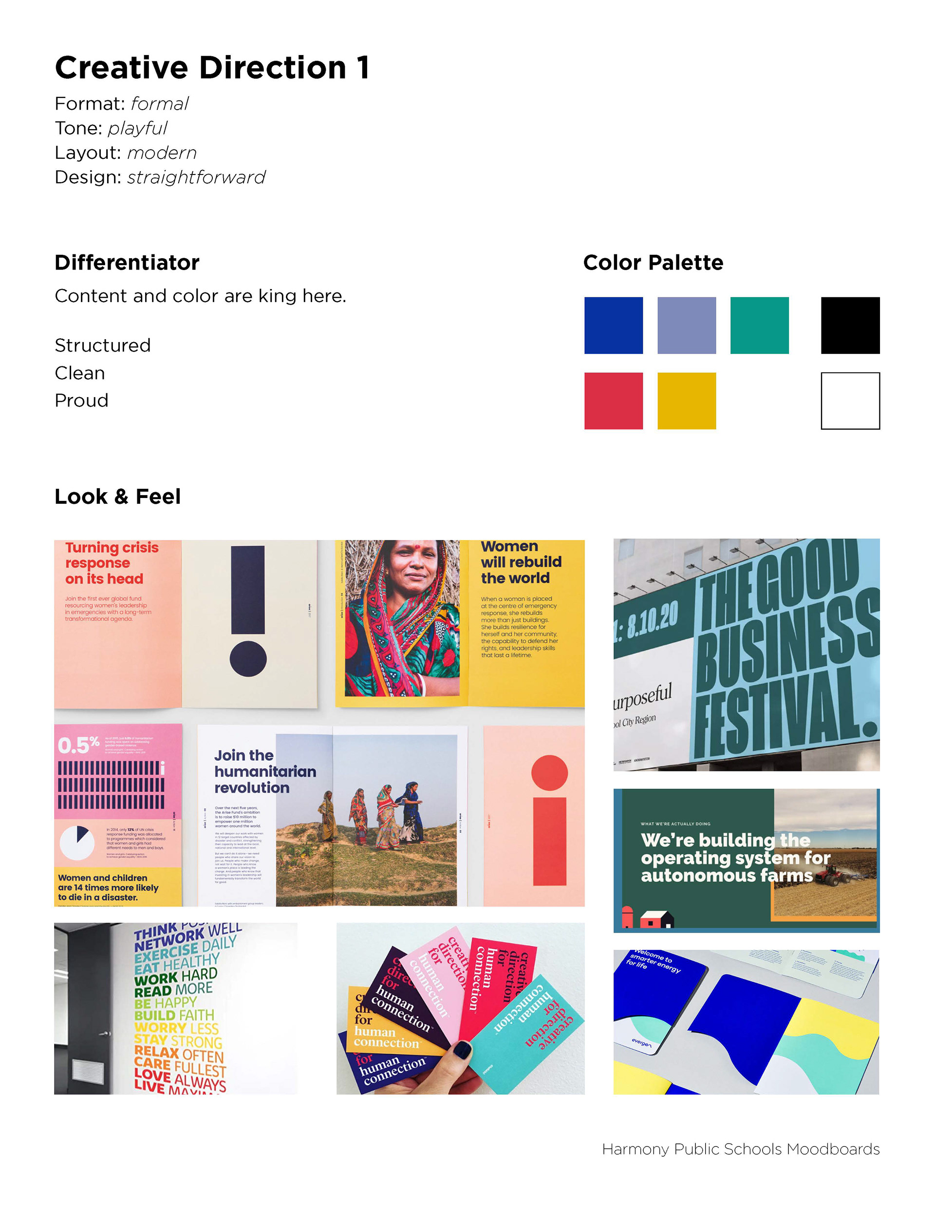
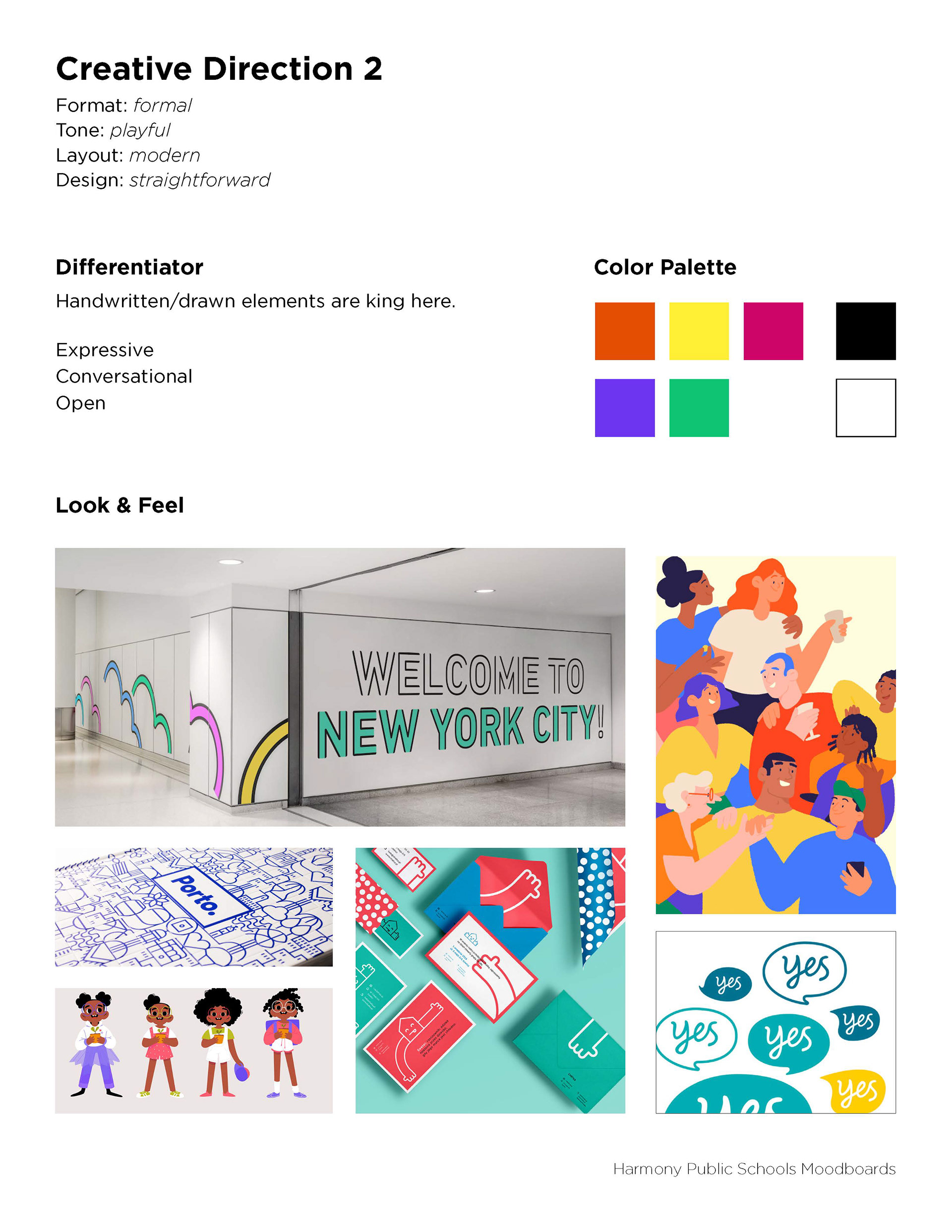
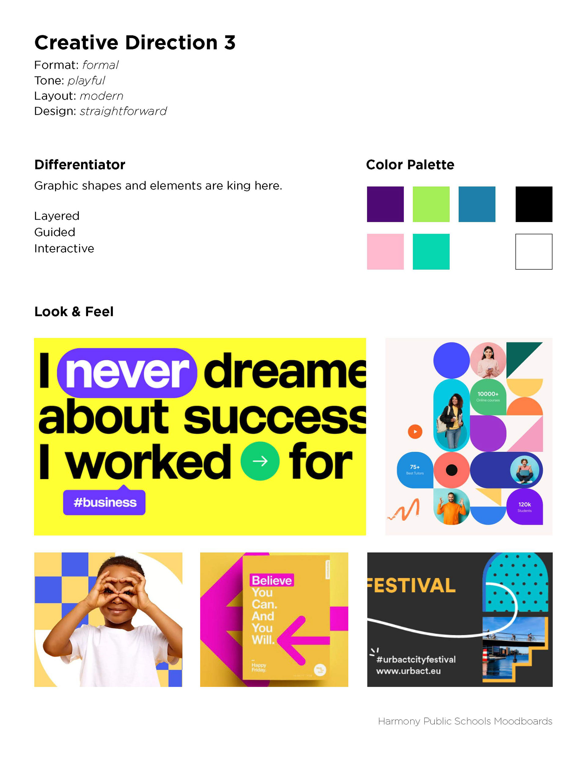
Goal: Harmony would like the new brand of the Success program to be a standalone service/product that could be used in ANY school nationwide and internationally.
__________________
Project: Develop a new brand for the Success program
Category: Environmental design, branding, identity
Goal: Harmony would like the new brand of the Success program to be a standalone service/product that could be used in ANY school nationwide and internationally.
__________________
My role: Art Director
Collaboration: Head of Client Services
Tools: InDesign, Illustrator, Photoshop
Collaboration: Head of Client Services
Tools: InDesign, Illustrator, Photoshop
MOODBOARDS
COLOR TESTING
Gentle pushback on layering certain colors on top of another.
Gentle pushback on layering certain colors on top of another.
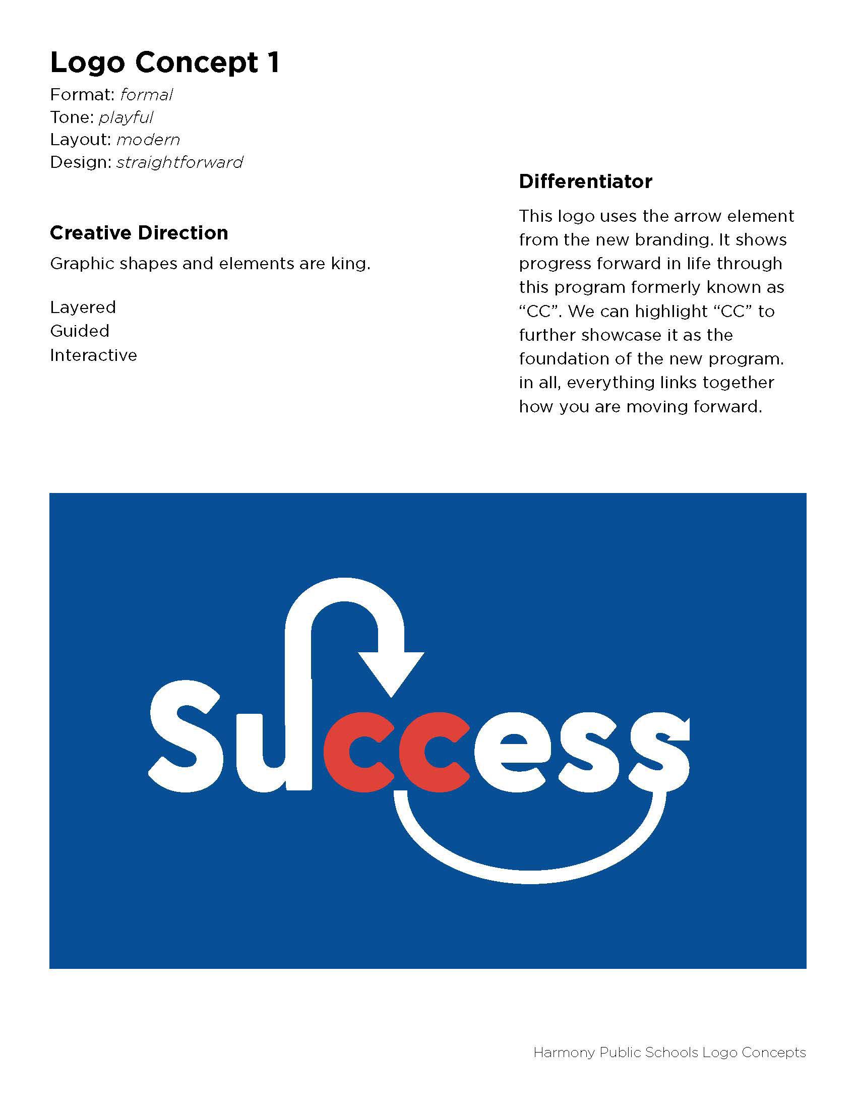
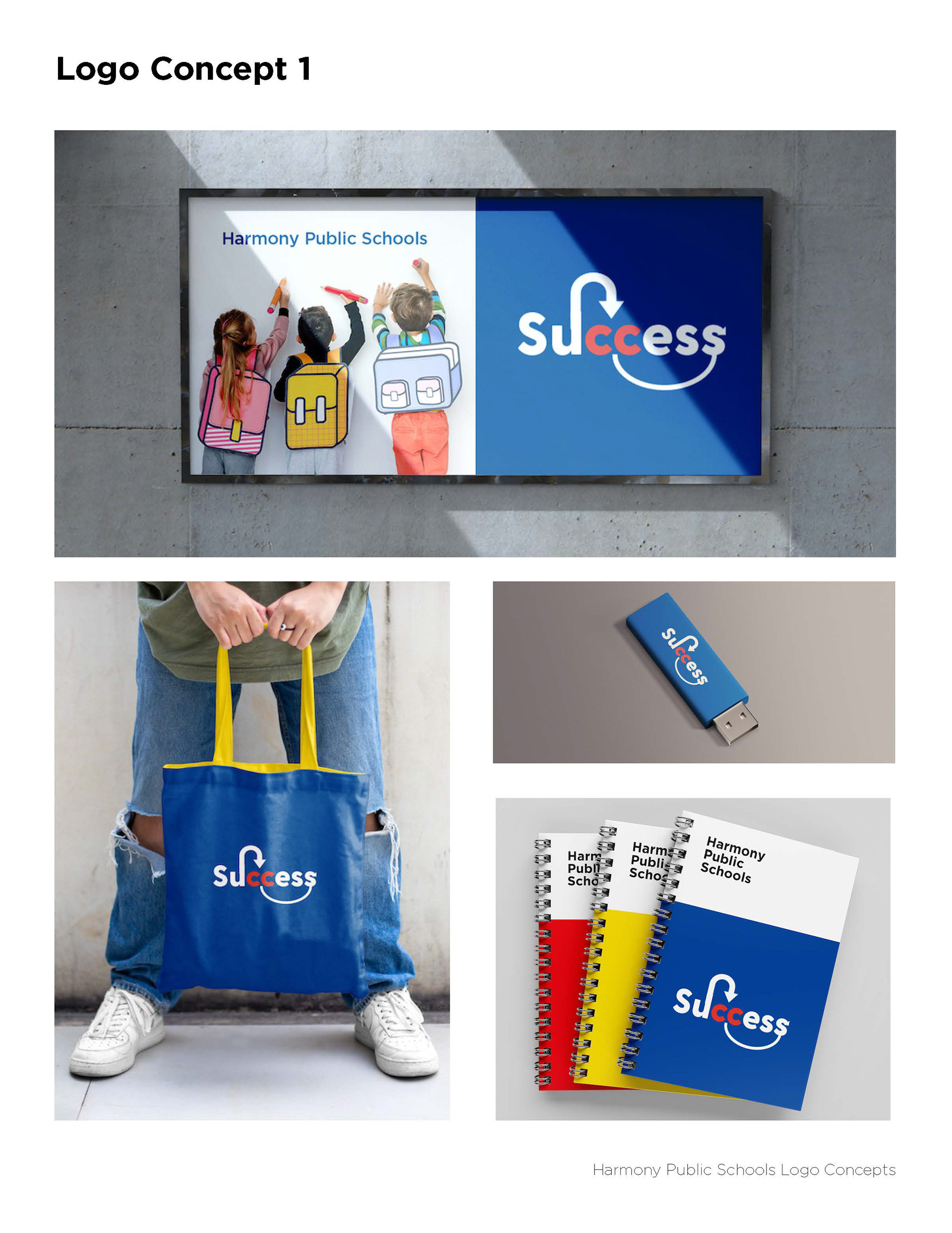
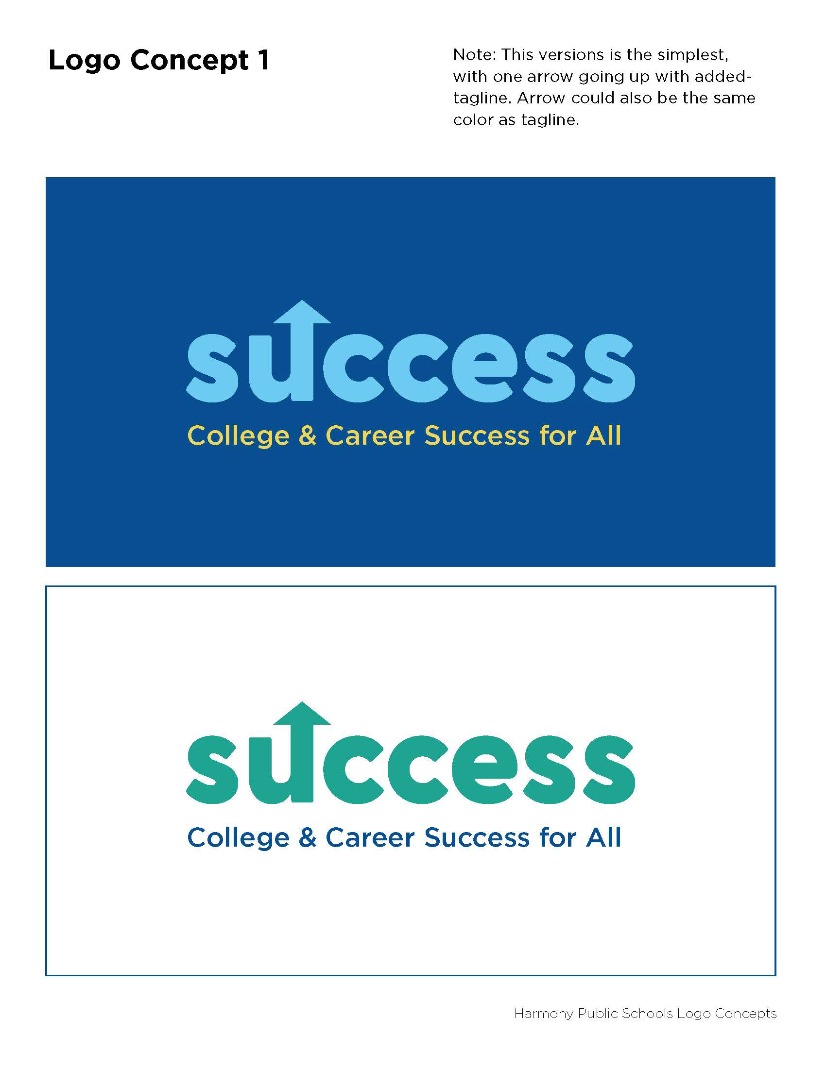
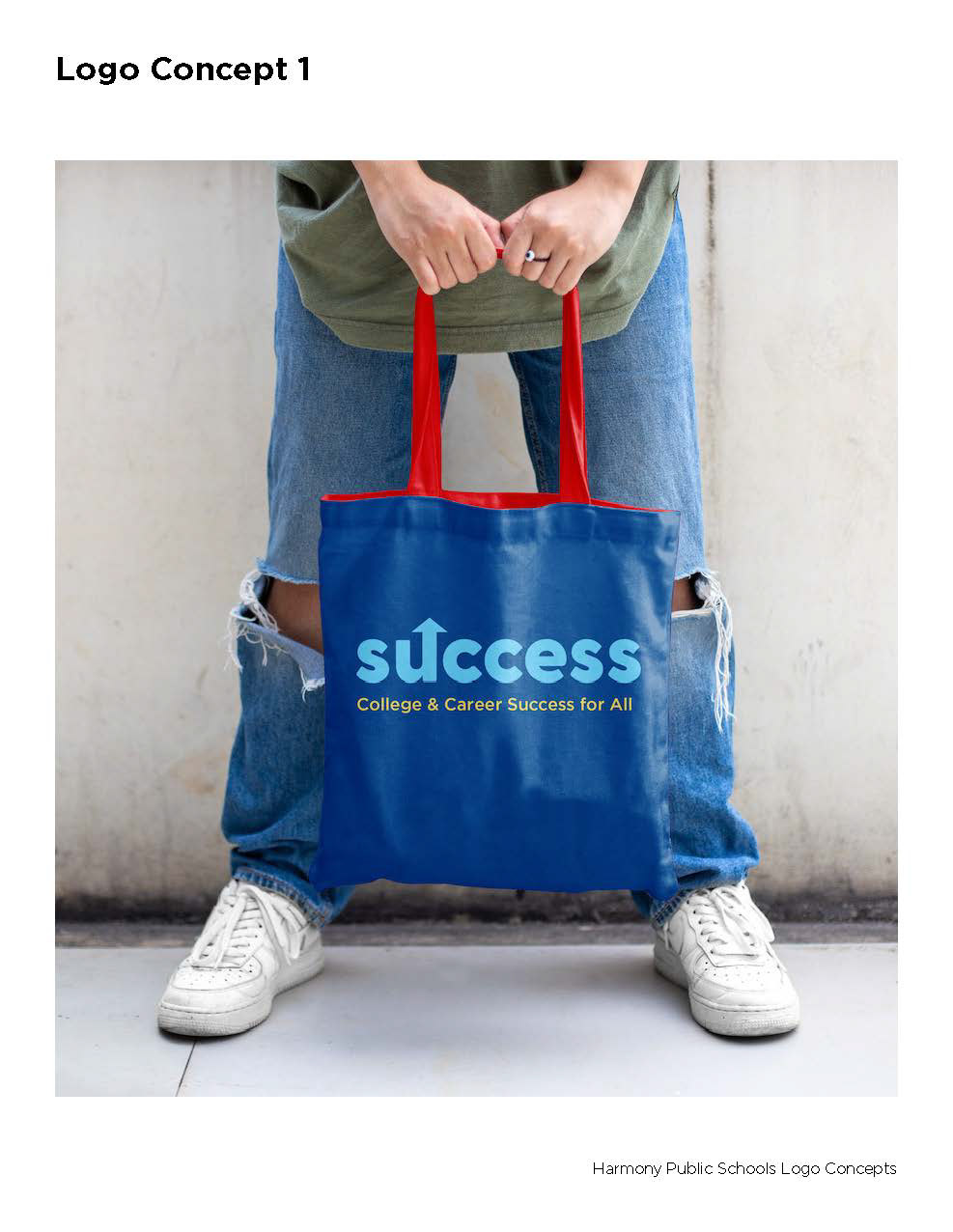
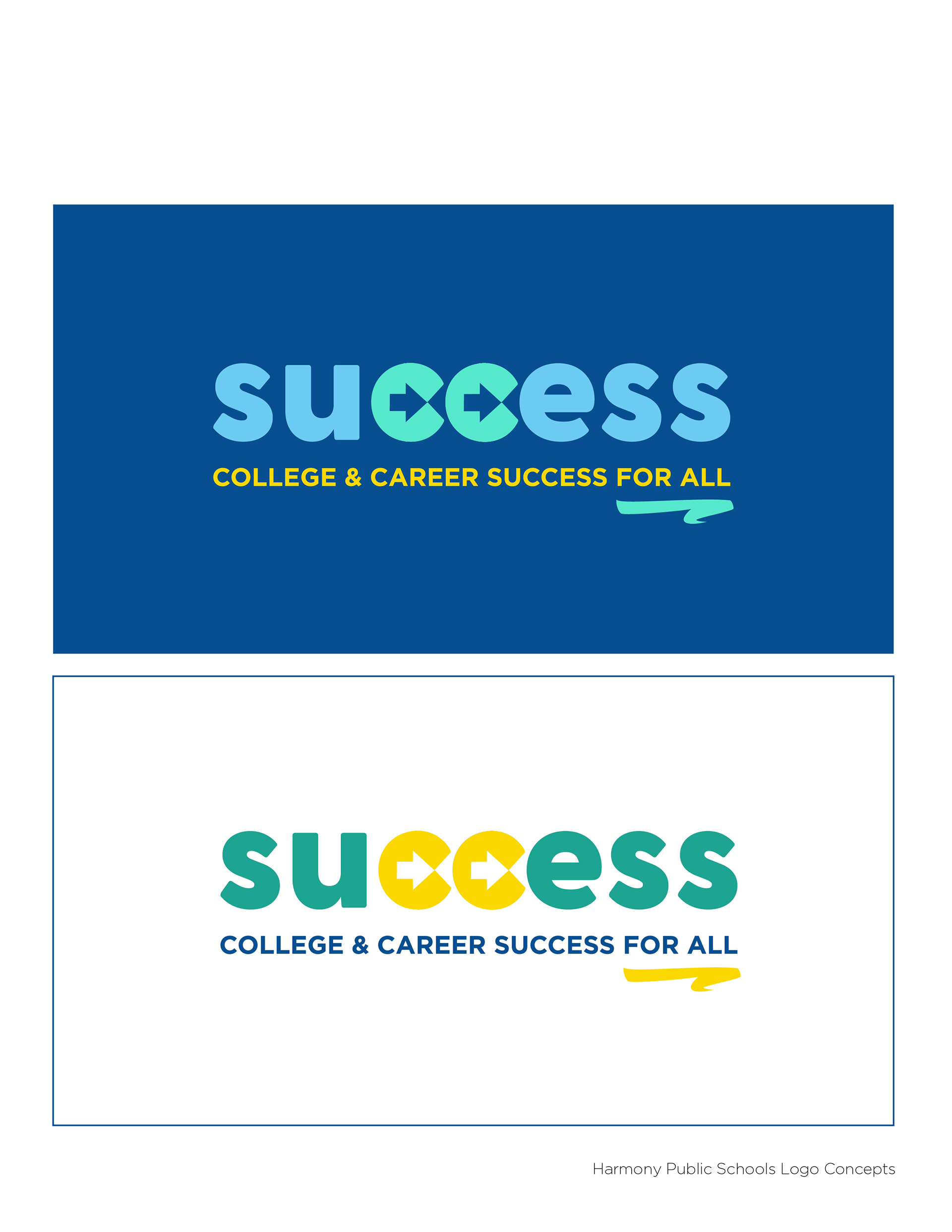
LOGO DESIGN - ROUND 1
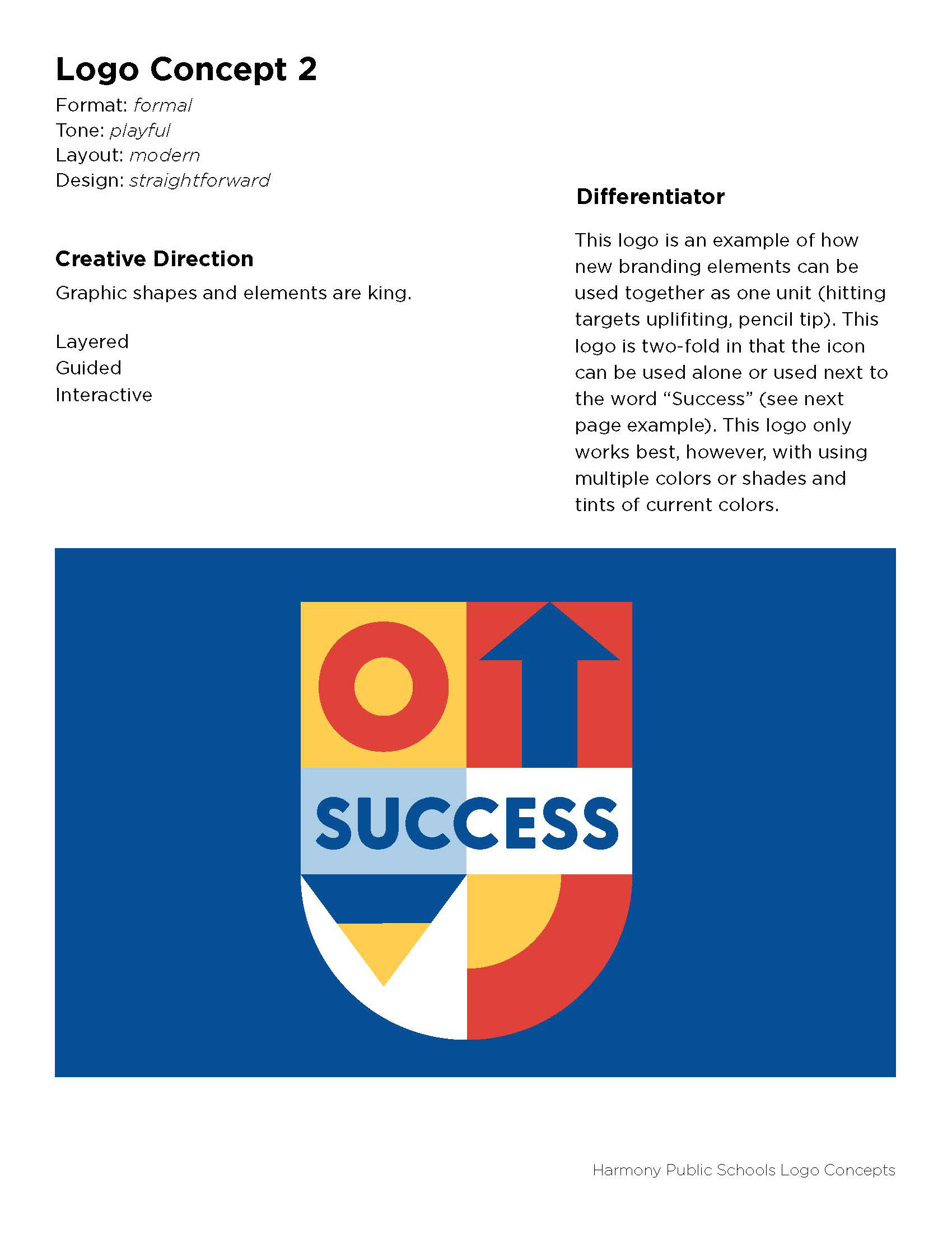
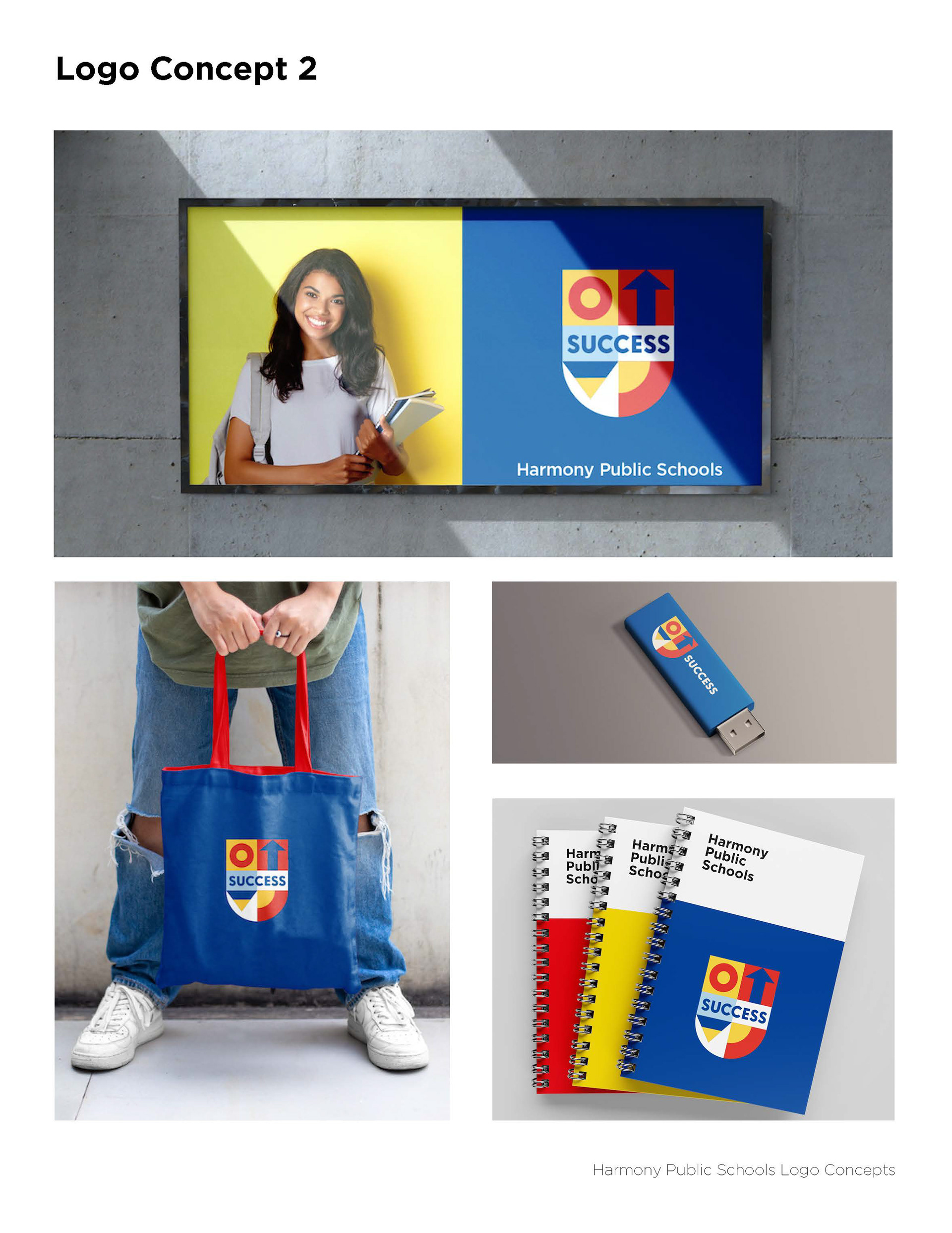
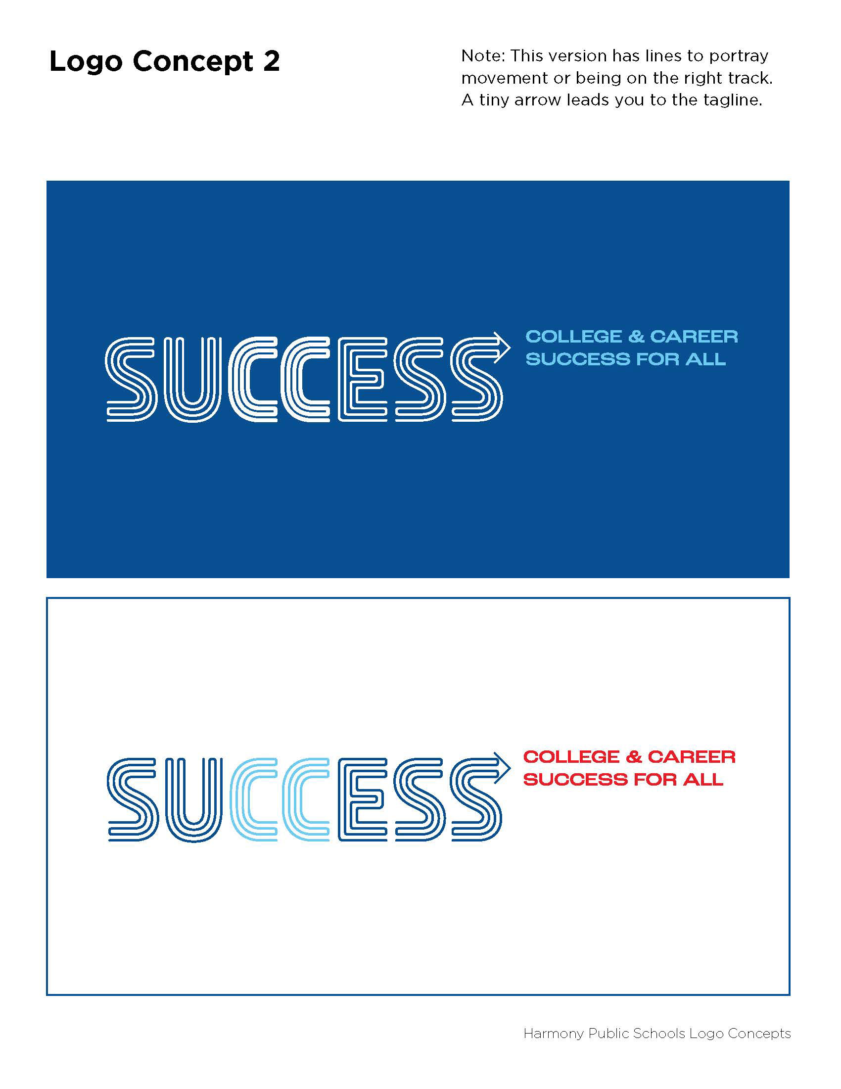
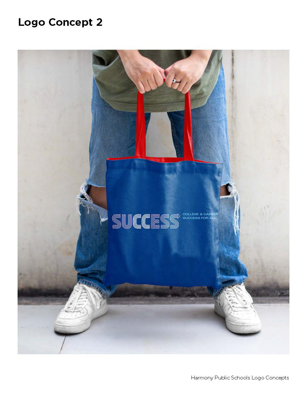
LOGO DESIGN - ROUND 2
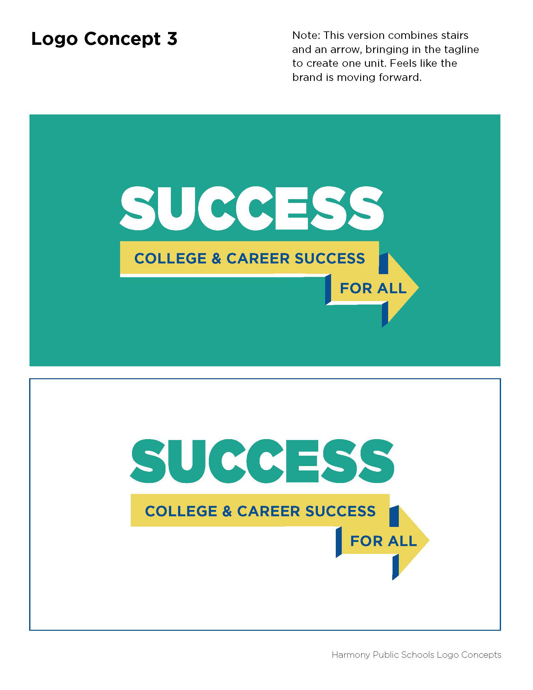
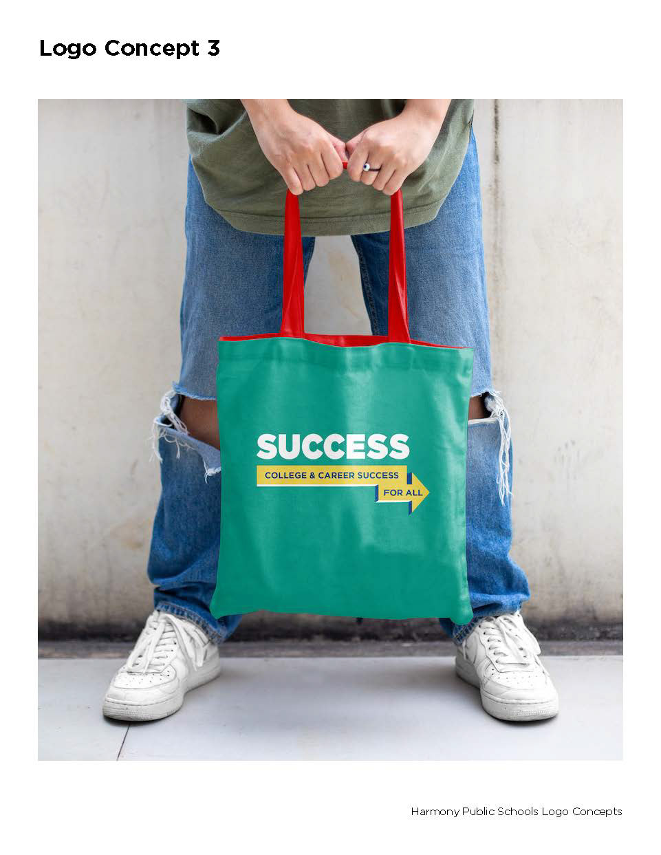
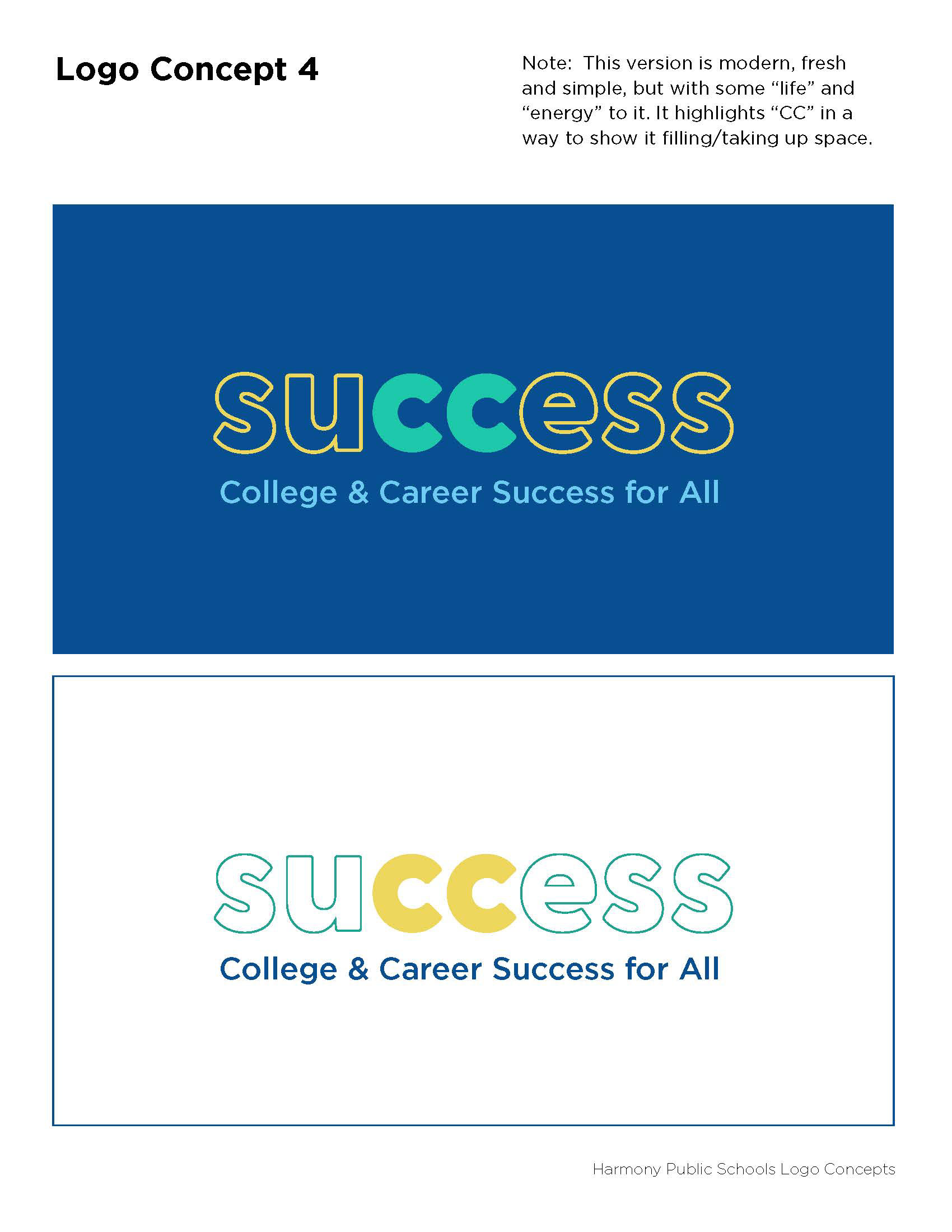
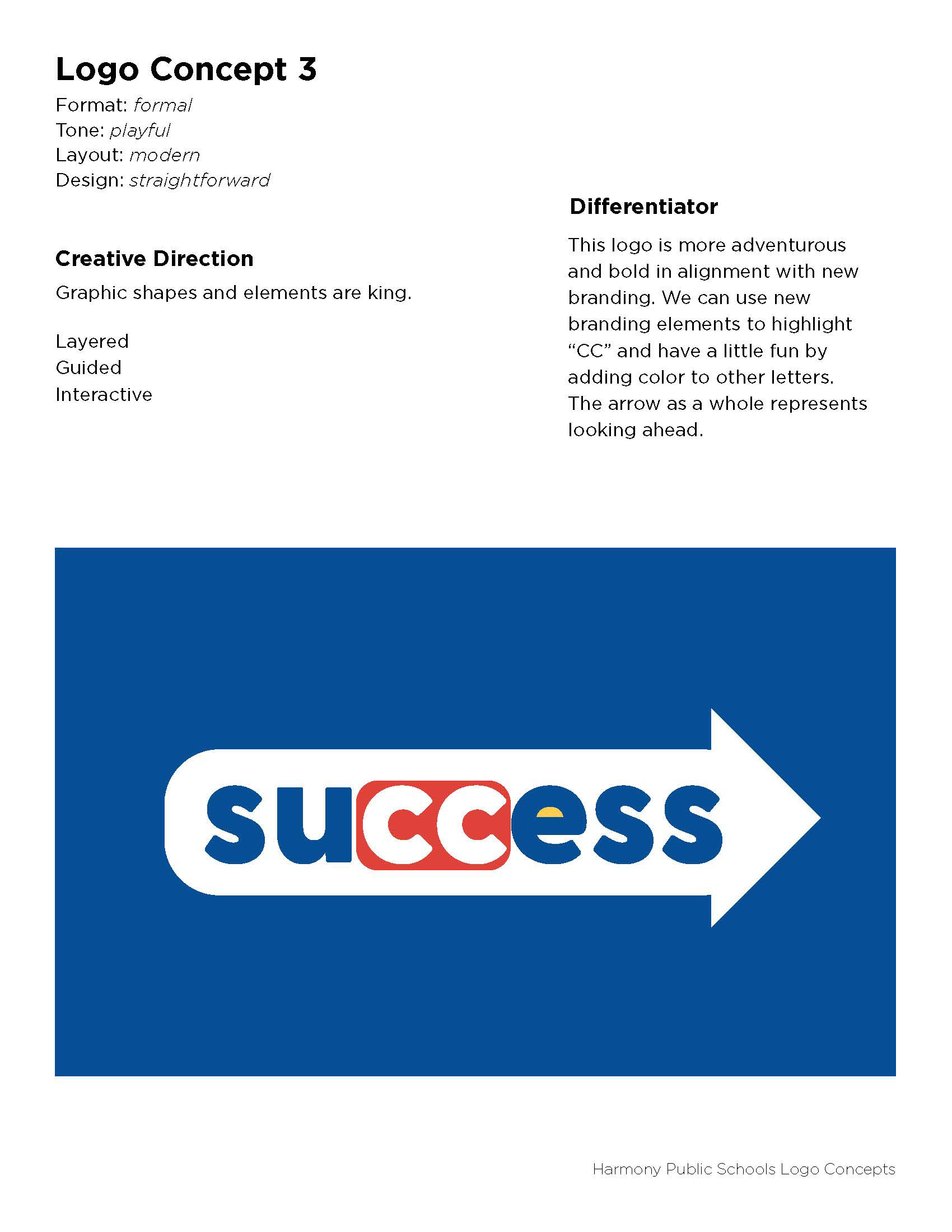
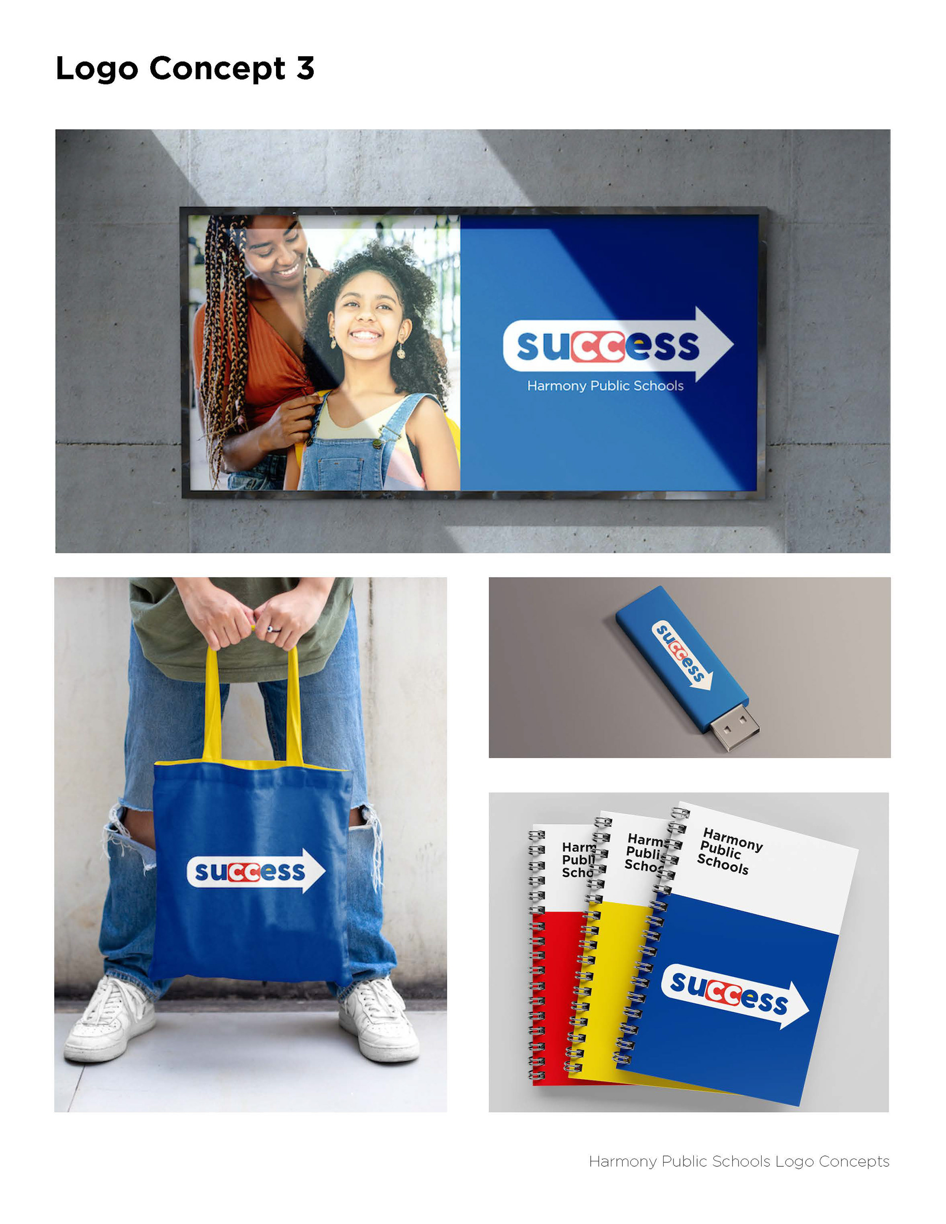
LOGO DESIGN - ROUND 3
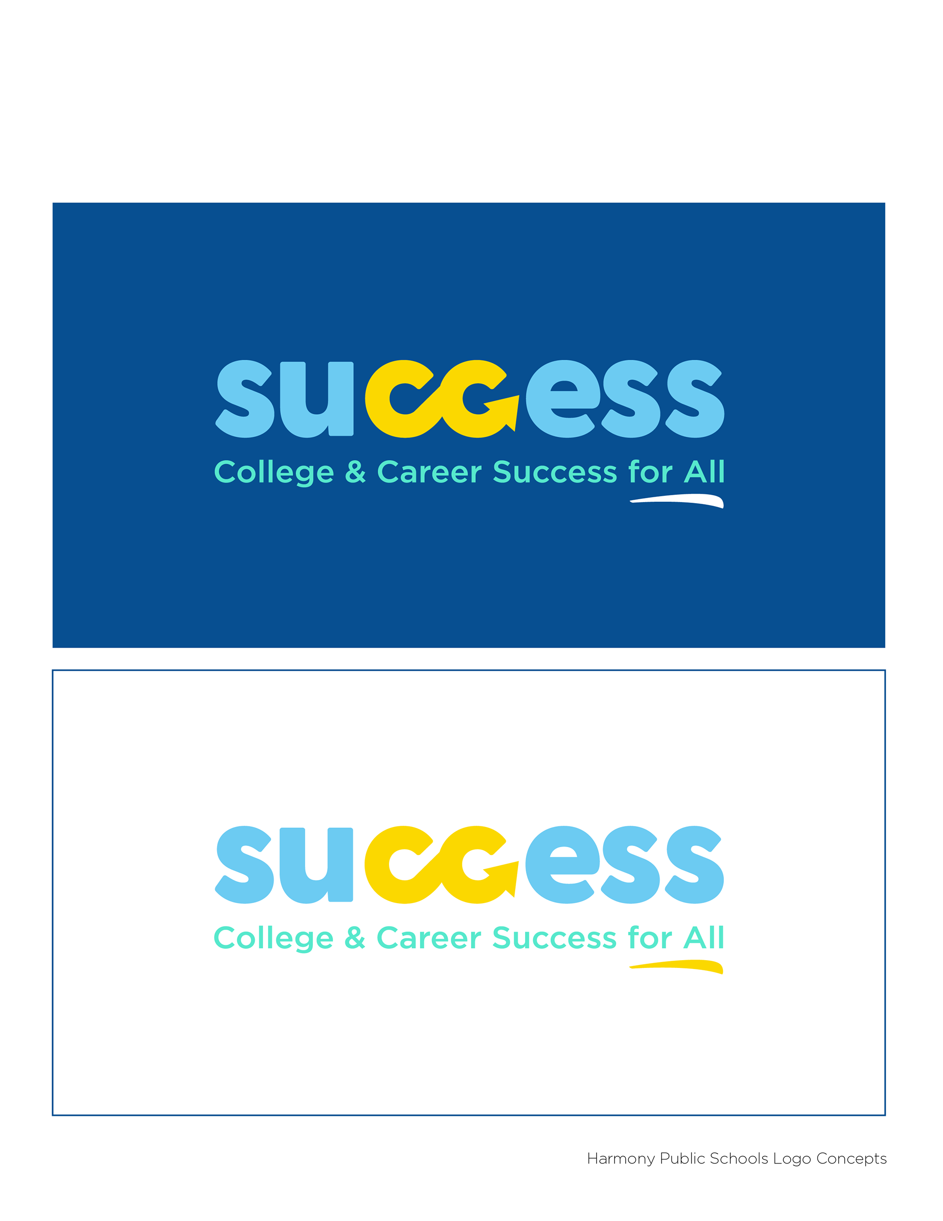
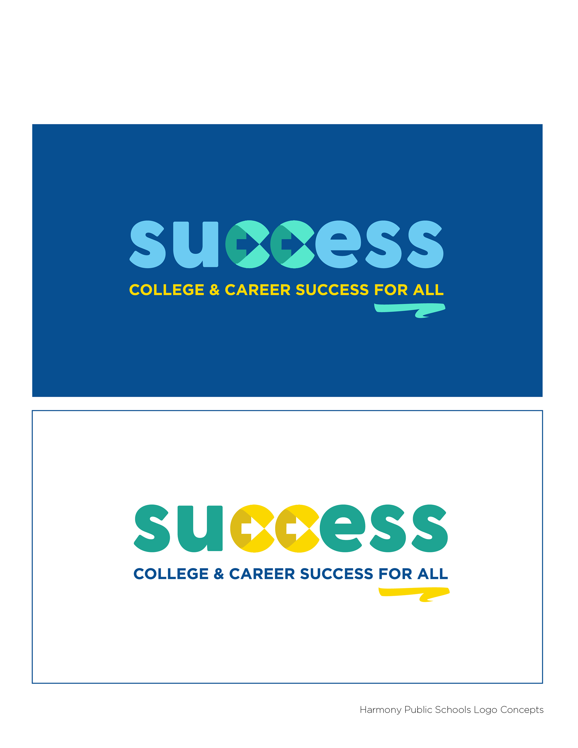
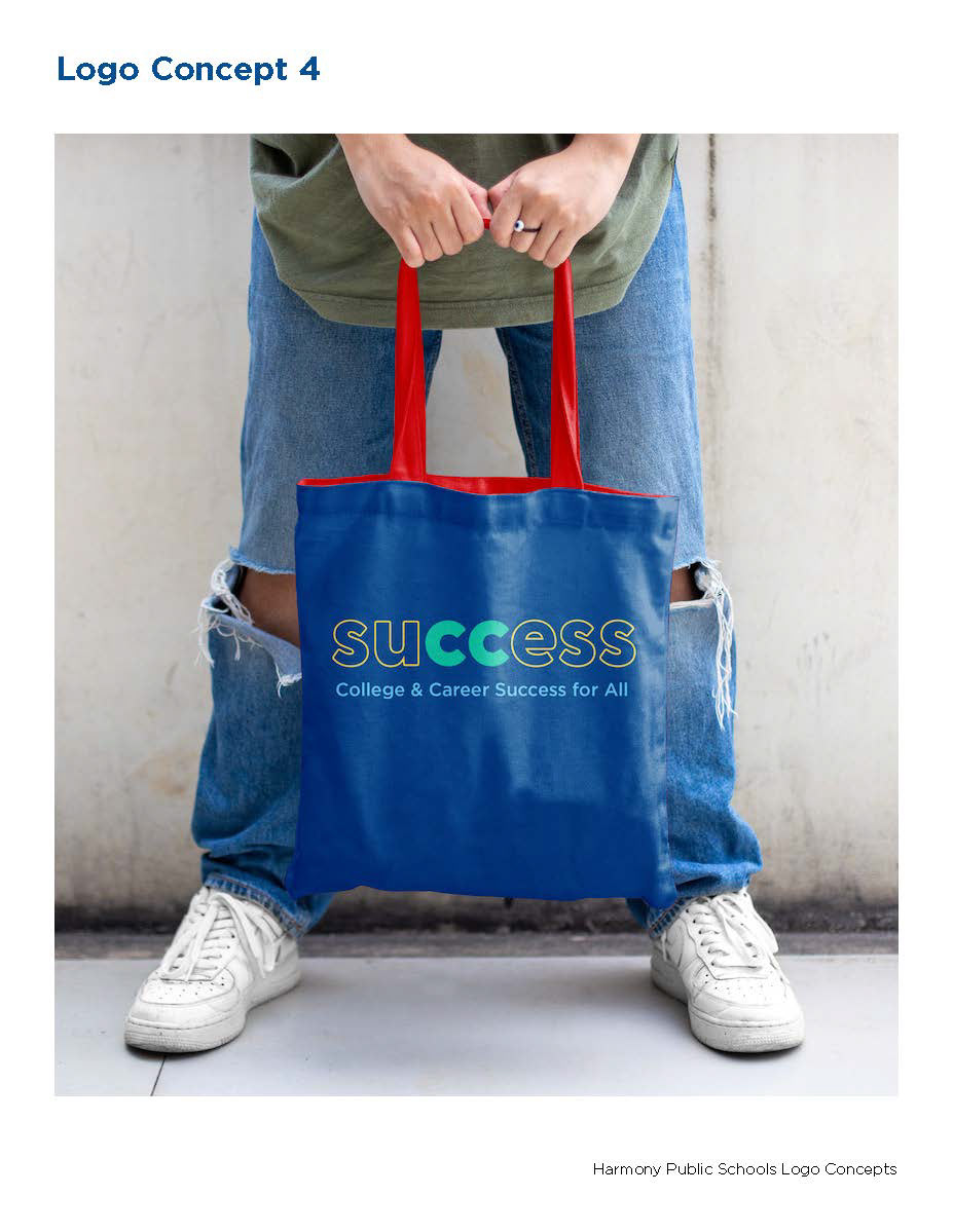
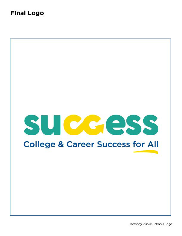
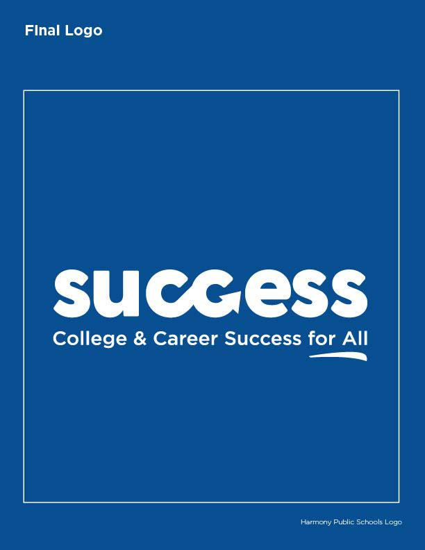
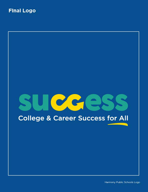
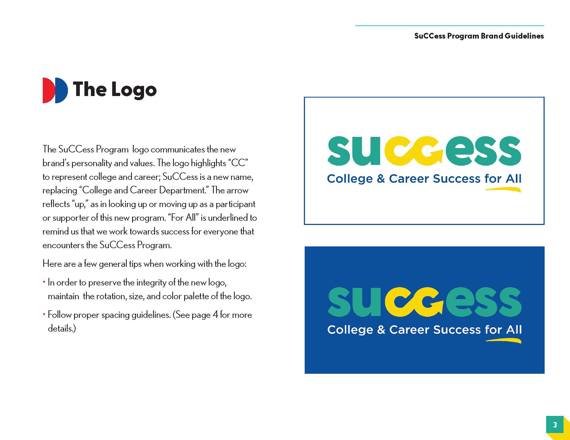
LOGO DESIGN - FINAL
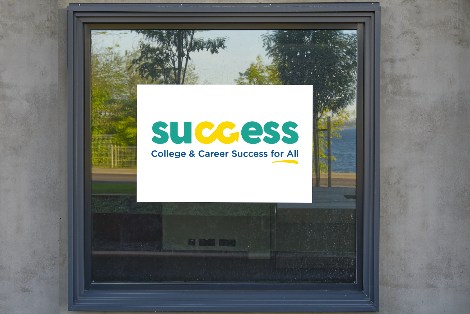
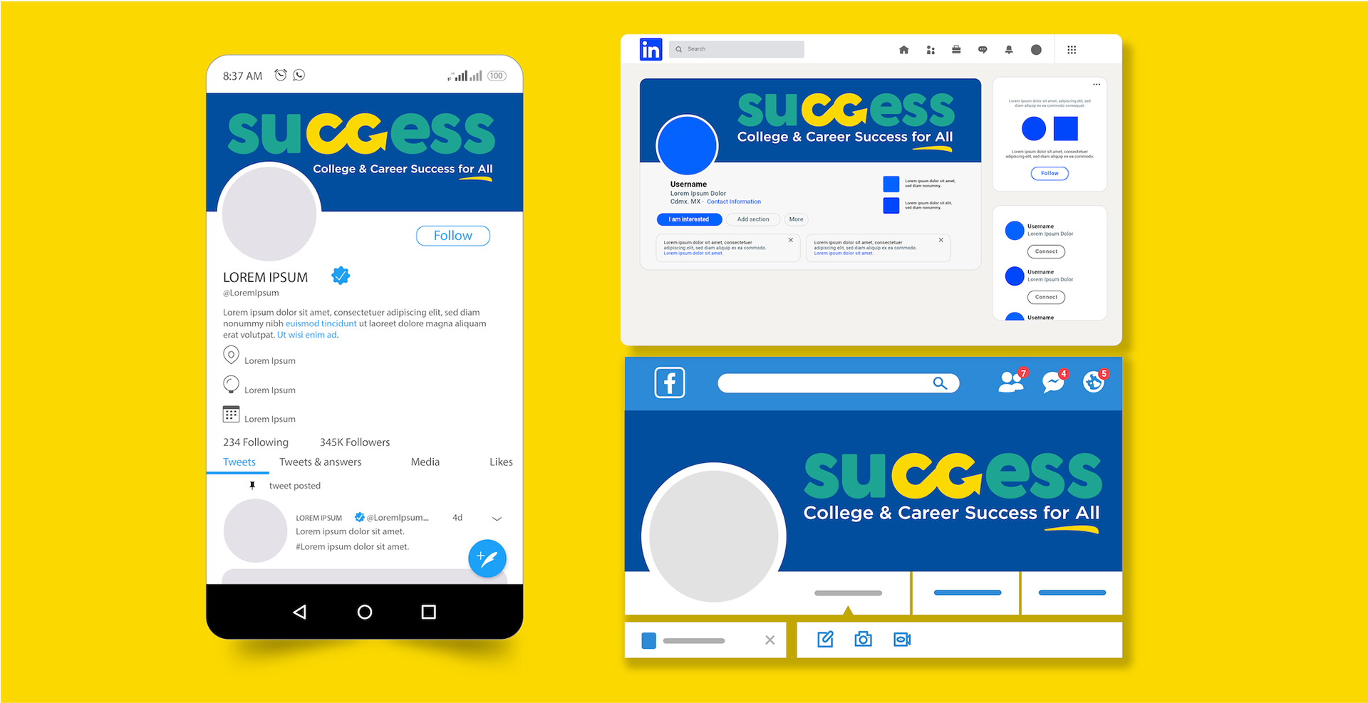
SIGNAGE AND SOCIAL MEDIA HEADERS
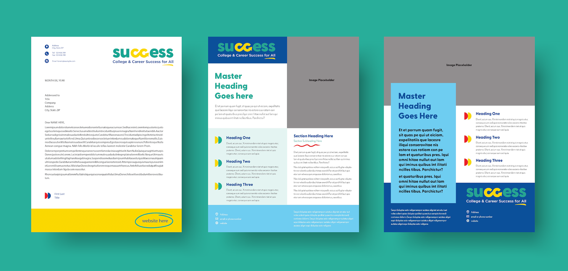
TEMPLATE DESIGN - LETTERHEAD AND ONE-PAGERS
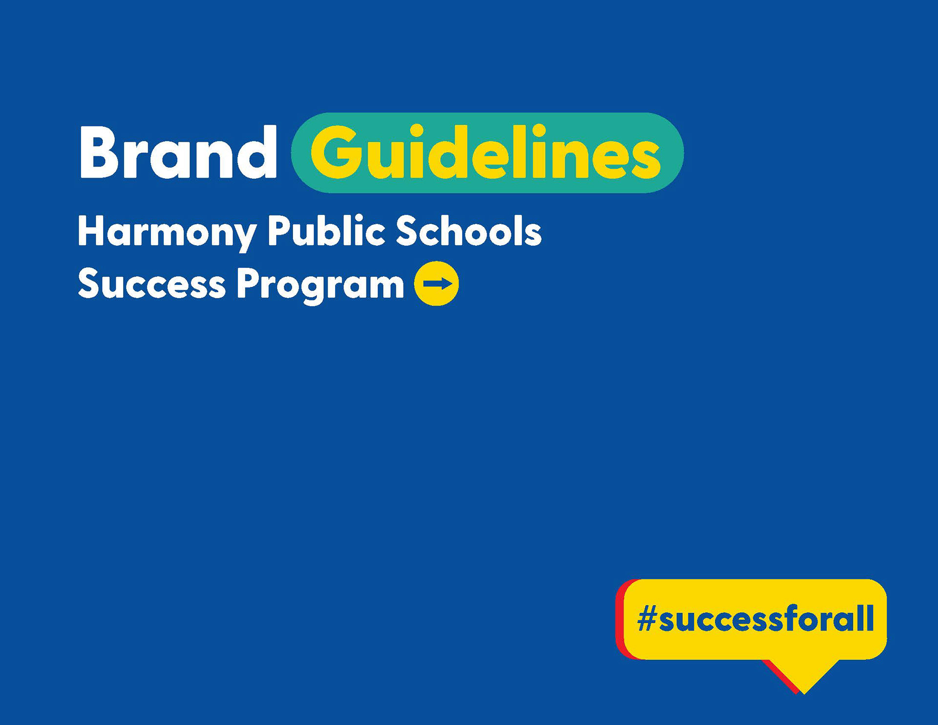
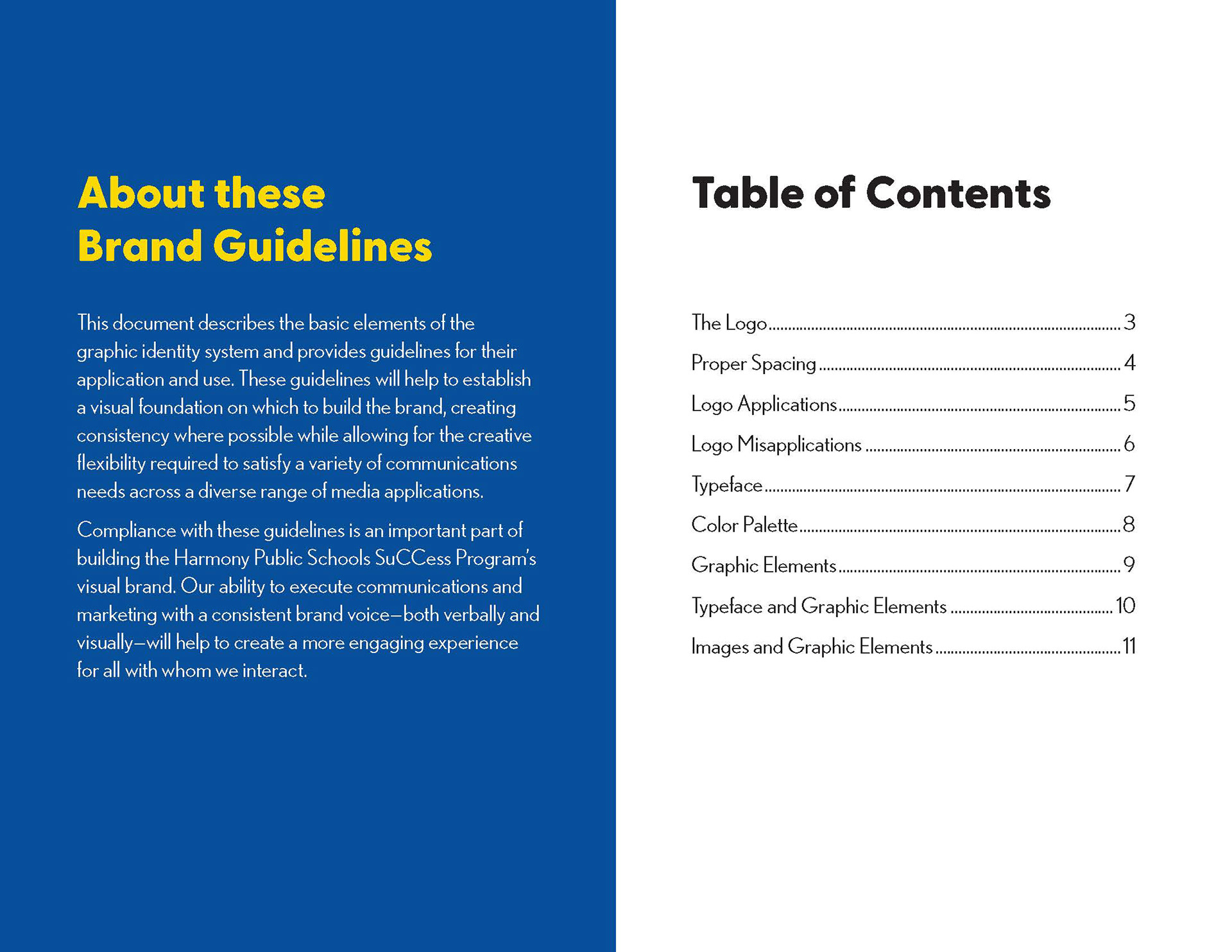
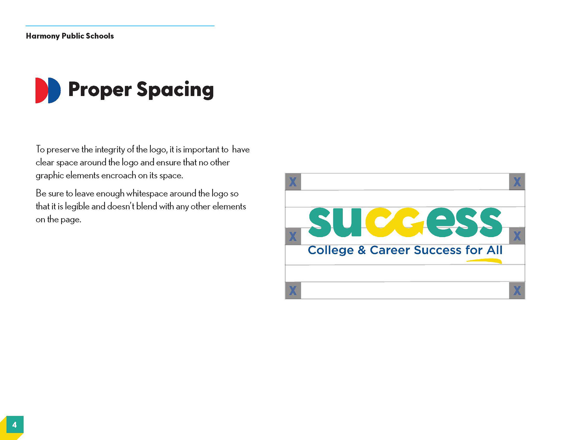
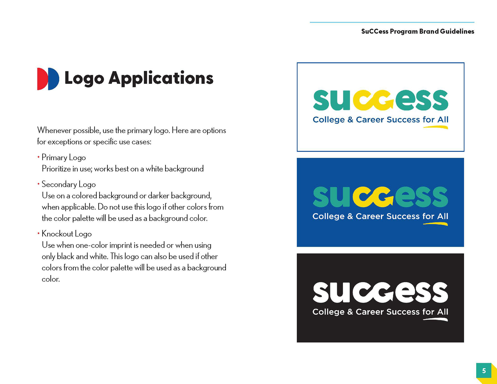
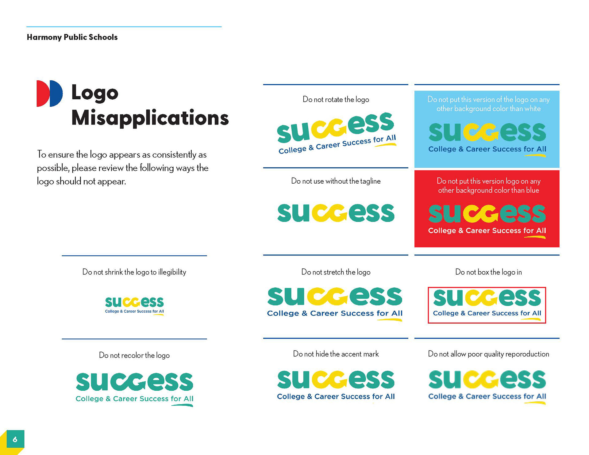
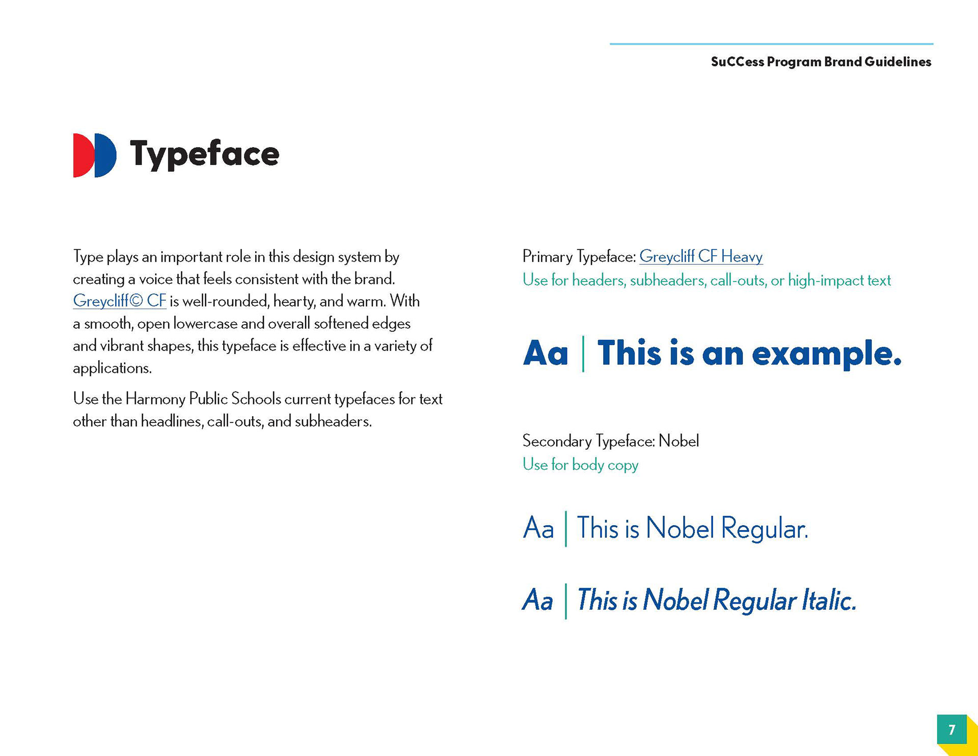
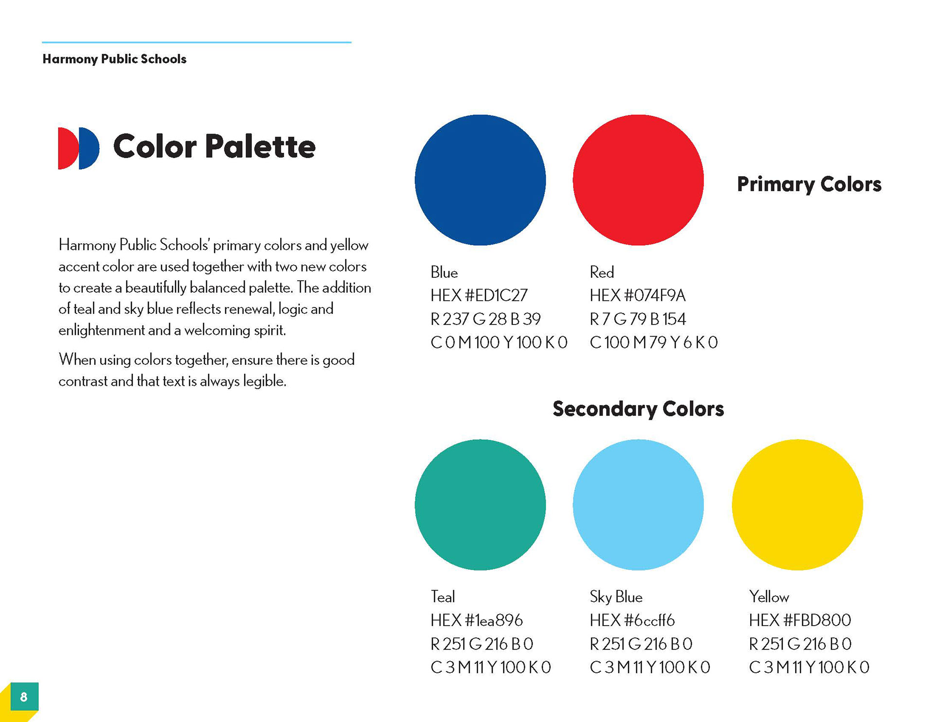
BRAND GUIDELINES DESIGN
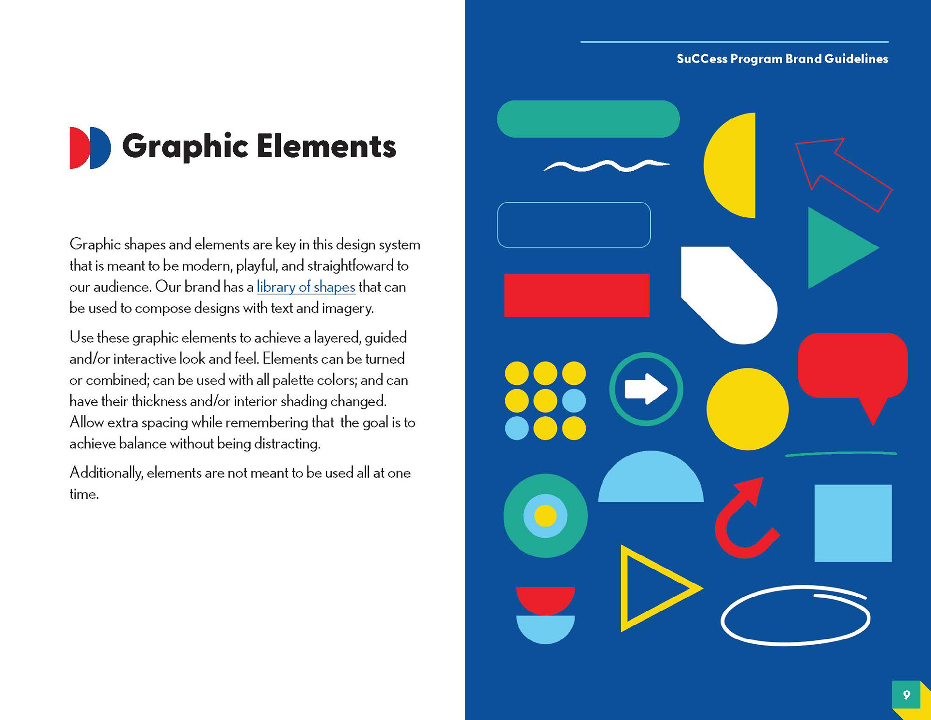
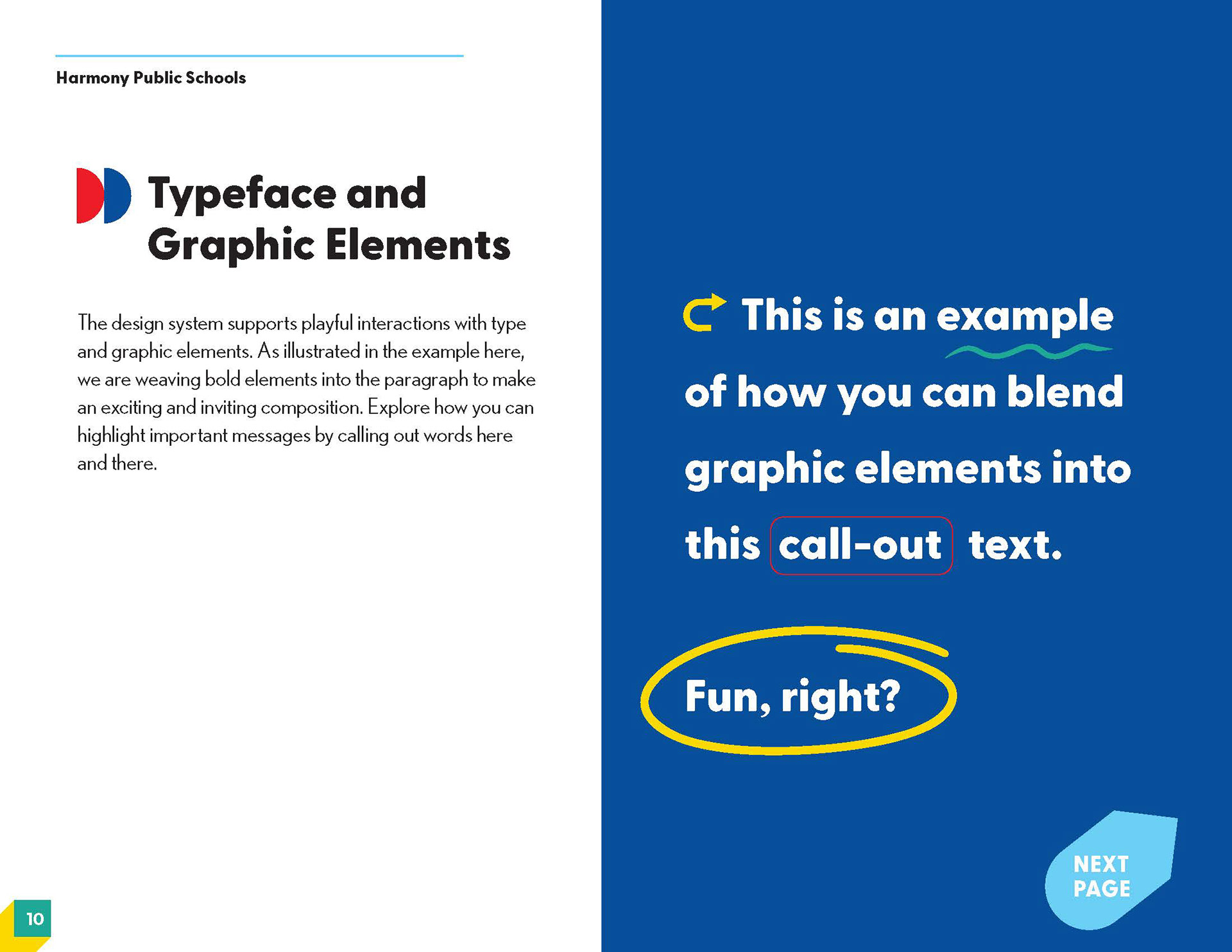
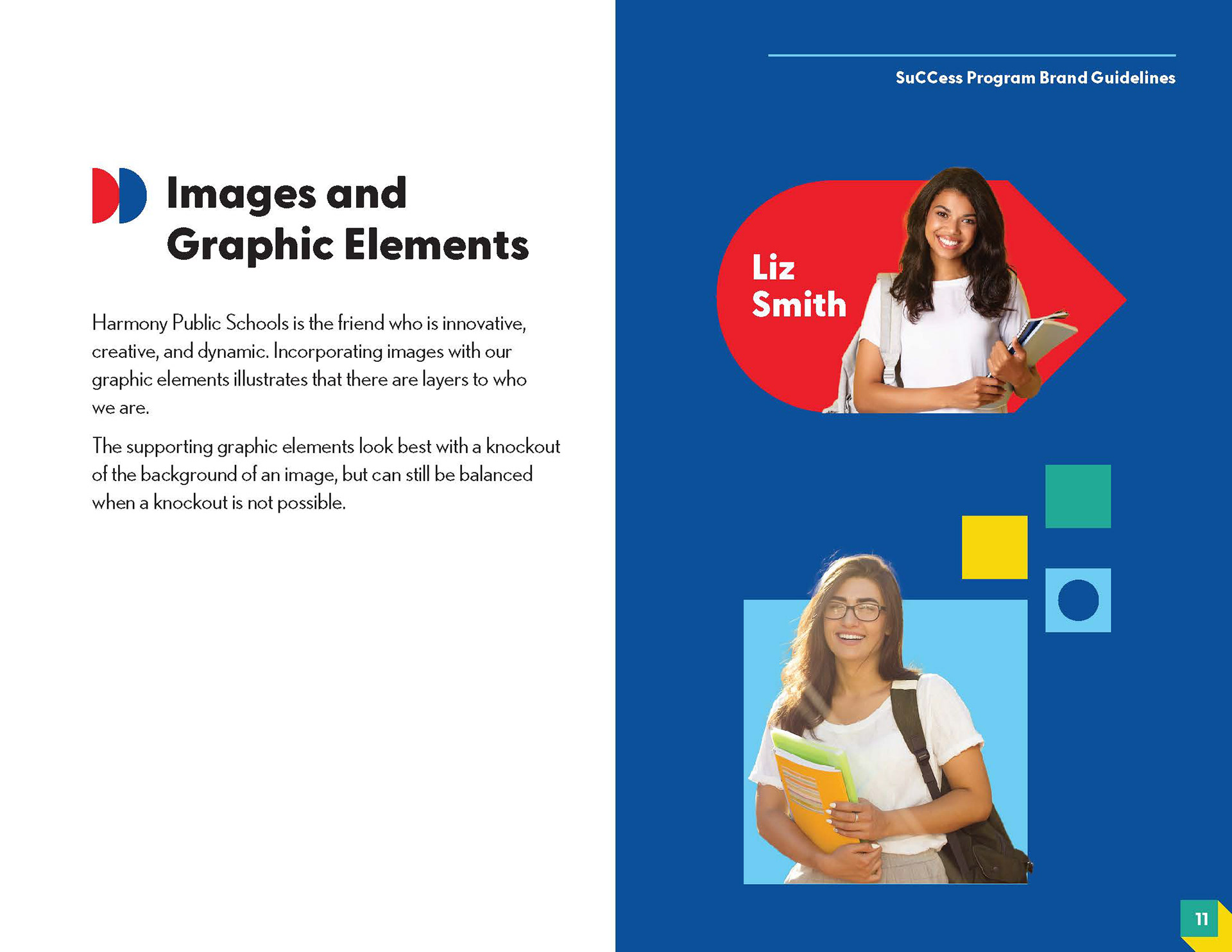
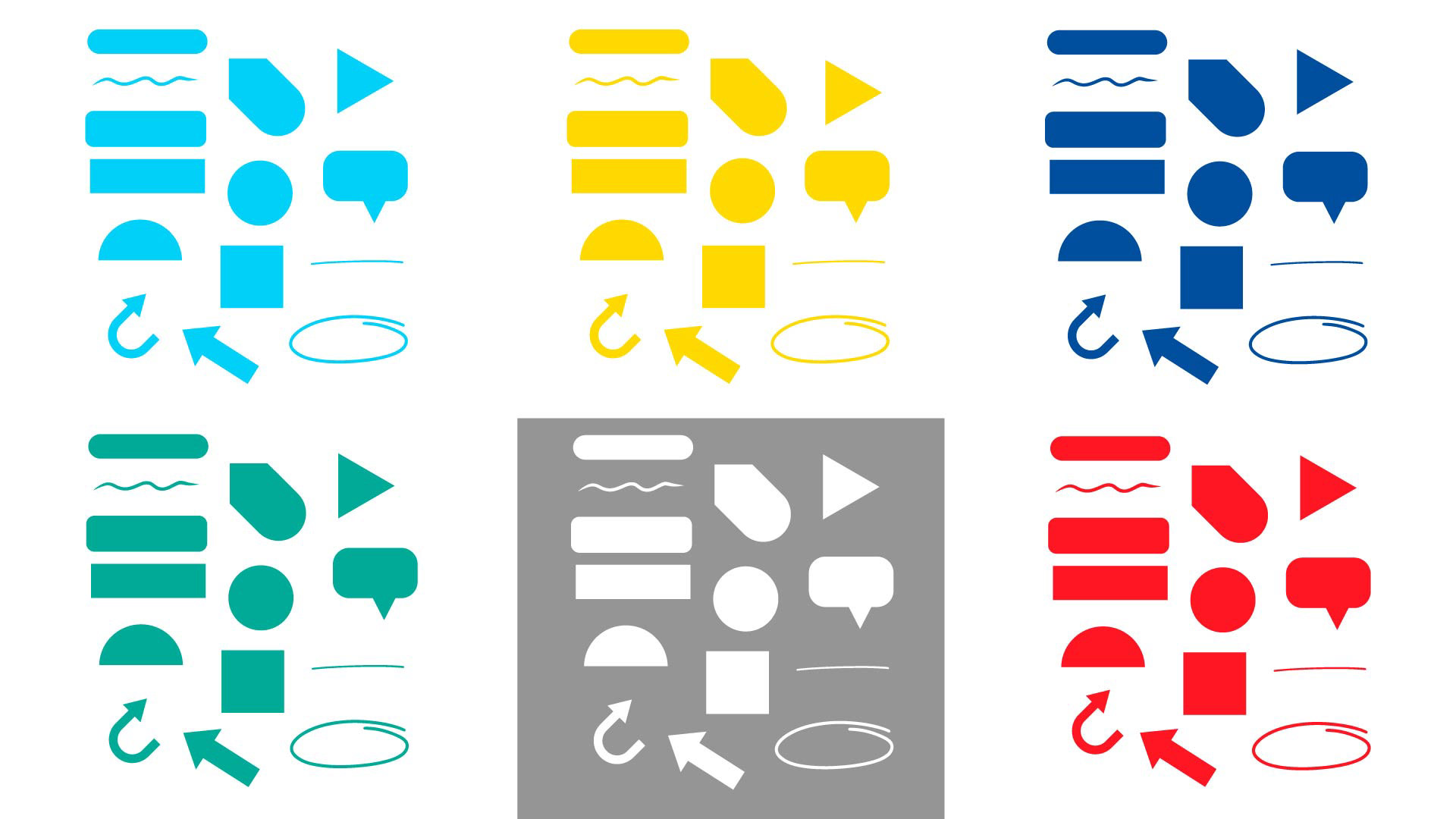
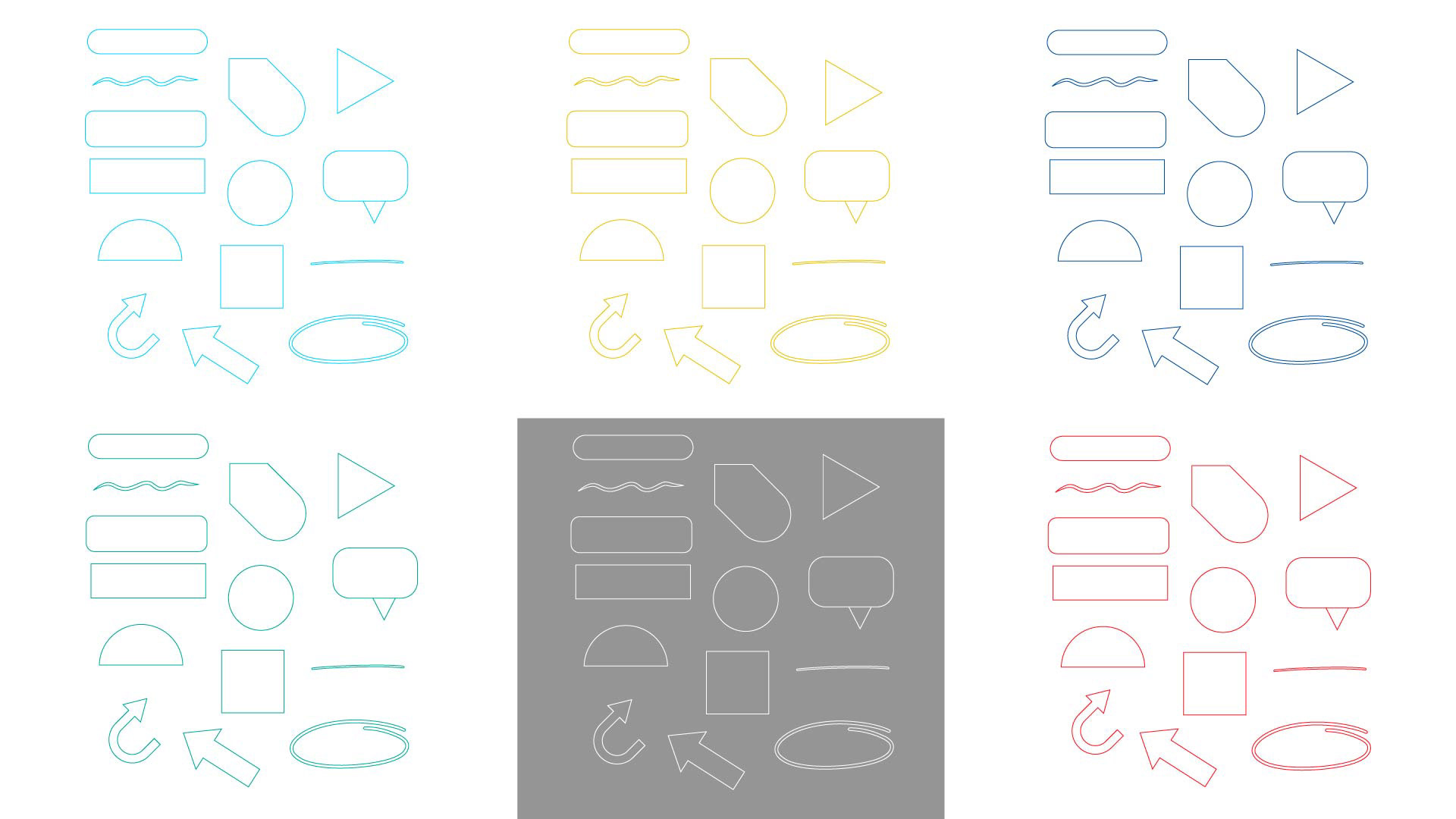
TOOLKIT ELEMENTS
Process:
Understand the program and positioning
Research and discovery
Align with stakeholders
Research and discovery
Align with stakeholders
__________________
Results:
“This gives our program a real identity—it finally feels ‘real.’”
Stakeholders felt that I understood their needs
The brand was widely used and translated well into social media assets for posting
Stakeholders felt that I understood their needs
The brand was widely used and translated well into social media assets for posting
__________________
Reflection:
I don't enjoy designing logos, actually! However, with the number of deliverables in this project and the end goal, I had fun with it. When I have a large project where I can balance my passions with what additional items are needed, I can still shine because I am able to view things from a bigger picture strategy.